If you create an e-commerce website, or a website for a company, there is a good chance that you will present the list of products or services offered.
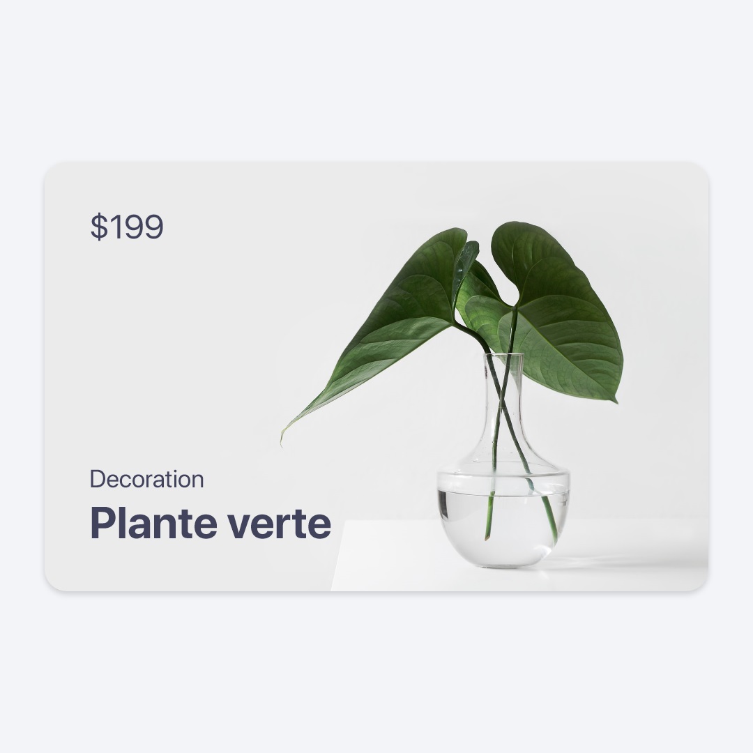
In this mini-tutorial, I will show you how to make a product card with CSS. The result will be as follows:
HTML Structure
Here is the basic structure in HTML:
<div class="card-product">
  <img class="card-img" src="leaves.jpg" alt="Card image ..." />
  <div class="card-top">
    <p class="price">$199</p>
  </div>
  <div class="card-bottom">
    <h4 class="category">Decoration</h4>
    <h3 class="title">Plante verte</h3>
  </div>
</div>
card-productis the main card wrapper.card-imgrepresents the product image.card-toprepresents what will be displayed at the top of the card (Product price).- And
card-footerrepresents the elements at the bottom (Product name, category).
React
Here is the equivalent in React (TypeScript):
export default function ProductCard({
  name,
  price,
  category,
  imageUrl,
}: {
  name: string,
  price: number,
  category: string,
  imageUrl: string,
}) {
  return (
    <div className="card-product">
      <img className="card-img" src={imageUrl} alt="Card image ..." />
      <div className="card-top">
        <p className="price">${price}</p>
      </div>
      <div className="card-bottom">
        <h4 className="category">{category}</h4>
        <h3 className="title">{name}</h3>
      </div>
    </div>
  );
}
CSS
Here are the CSS rules we apply to these elements:
.card-product {
  display: block;
  border-radius: 1rem;
  overflow: hidden;
  color: #41425b;
  box-shadow: 0px 2px 4px rgba(0, 0, 0, 0.16);
  position: relative;
  aspect-ratio: 4/3;
  width: 22.5rem;
  background-color: #e1e1e1;
}

.card-product .card-img {
  position: relative;
  z-index: 0;
  width: 100%;
  height: 100%;
  object-fit: cover;
  display: block;
}

.card-product .card-top {
  position: absolute;
  z-index: 1;
  left: 1.5rem;
  top: 1.5rem;
}

.card-product .card-bottom {
  position: absolute;
  z-index: 1;
  left: 1.5rem;
  bottom: 1.5rem;
}

.card-product .price {
  margin: 0;
  font-size: 1.5rem;
}

.card-product .title {
  margin: 0.5rem 0 0 0;
  font-size: 2rem;
  font-weight: bold;
}

.card-product .category {
  margin: 0;
  font-size: 1.25rem;
  font-weight: normal;
}
About the main wrapper card-product, here we use the aspect-ratio CSS property so that the cards have the same proportion. Here, we set its value to 4/3 but you can change it (eg 1/1 for a square card).
We use the relative value for the position property, so that child elements with absolute position, position themselves relative to this element.
We added a box-shadow so that the card has an elevated appearance.
For the product image card-img, we use the object-fit: cover declaration so that the image is not distorted. It is recommended to use an image with the same proportion as the aspect-ratio of the card-product wrapper.
card-top and card-bottom are placed in absolute position, one at the top (top: 1.5rem) and the other at the bottom (bottom: 1.5rem). We added a z-index to place them above other elements (such as the image).
Practice
As an extension or improvement of the project, you can try to use flexbox to distribute the layout of the card (card-top and card-bottom). You can also add animations (zoom of the image on hover for example).
I hope you liked this mini-tutorial.
Source
You can find the source code here.